Bringing Wisconsin’s oldest art organization into the 21st century.
PROJECT
Organizational Rebrand
PARTNER
Wisconsin Visual Artists
ASSIGNMENT
Brand Research
Brand Strategy
Logo Design
Pattern Design
Letterhead Design
Business Card Design
Brand Photography
Brand Guidelines
―
Wisconsin Visual Artists (WVA), the state's oldest art organization, champions visual artists working within the state. It utilizes its collective creativity to instigate productive dialogue and positive change within its communities.
Their new Director was brought on to help breathe fresh air into the organization to attract young, new membership. Her first priority? Hiring Unlisted with the goal of helping bring the brand into the 21st century with a new logo and brand identity.

OUR APPROACH
Our goal was to establish Wisconsin Visual Artists as a trusted resource for museums, galleries, art venues, and buyers. To do this, we needed to create a brand that was both visually impressive, dynamic and inclusive to sufficiently represent the artists who make up the organization’s membership.

A logo symbolizing strength and support.
In creating their new logo and brand identity, we were careful to represent all disciplines of visual art, leading us to choose the hand as our inspiration for the primary logo mark. The hand is the "tool of tools", used to make and create.
The icon symbolizes strength, power and support. In an uplifting position, the mark is a dual-representation of both the supportive nature of the organization and the hands of the makers it connects, educates and empowers.
Because of the various diverse audiences of WVA, it was additionally important we create a logo that was also flexible enough to translate across mediums, formats and effectively speak to multiple audiences.
BRAND VISUALS
Something about the overall brand identity, color palette and typography.
Taking the imagery into our own hands.
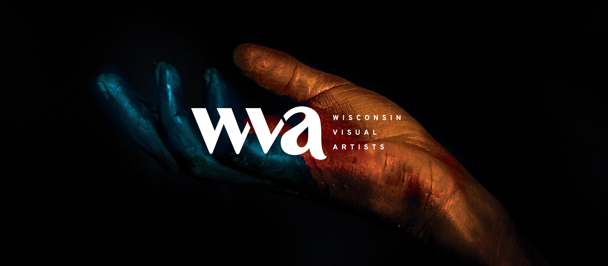
When we couldn’t find the perfect photo to represent our idea, we took it into our own hands. Literally. Our in-house micro-studio gives us the ability to capture ideas and branded content on the fly. Our goal with every brand we create is to eliminate generic imagery that is a result of low budget and quick turn-arounds. So, in this case, when we had the idea of bringing the concept to life, it meant pulling out our paints and getting crafty.
Bringing the brand to life.
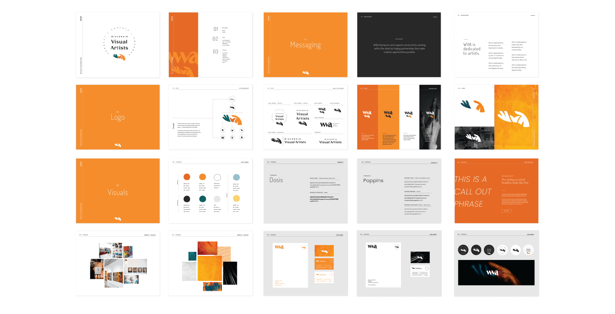
To help set the organization’s director up for success, we updated the brand’s outdated collateral to reflect the new brand identity including branded exhibit wallpaper patterns, business cards, letterhead, one-sheets, handouts, and website graphics.
Guidelines to keep it consistent.
As with each and every one of the brands we develop, we want the client to maximize its use long after we’re gone. So, the new identity for WVA was documented in a foolproof, comprehensive brand guidelines booklet to ensure the new look and tone would be translated consistently from art exhibits to website to membership emails.

CONCLUSION
In less than 4 months, we were able to successfully modernize the 120 year old organization’s brand to represent and attract the next generation of visual artists.


