A hand-crafted brand evolution for a high end catering company.
PROJECT
Brand Evolution & Launch
PARTNER
Heirloom Kitchen Co.
ASSIGNMENT
Brand Strategy
Brand Messaging
Brand Identity
Logo Design
Illustration
Graphic Design
Menu Template Design
Website Design
Squarespace Website Development
PROJECT OVERVIEW
Heirloom Kitchen Company is Wisconsin-famous for catering the best-tasting catering around. Having traditionally relied on word of mouth to advertise, their brand and messaging lacked the same love that was put into their food. It was time for the brand to evolve and they needed the right branding and marketing partner to capture and articulate the essence of what makes the business so special
A STRATEGIC APPROACH
Eating, drinking and breathing the brand.
Although we’re always hungry for a good challenge, as soon as we experienced Heirloom Kitchen Company's food, we knew our job would be easy.
First, we dove in to understand the short- and long-term business goals, analyzing those against the existing brand presence. Next, we executed a competitive analysis to identify visual and messaging opportunities that would elevate and truly differentiate Heirloom Kitchen Company, not only within their industry but adjacent ones as well. After our comprehensive research and discovery phase, we went on to execute a full rebrand including new messaging, a logo and visual identity, website and marketing materials.


Mouth-watering messaging.
Messaging that truly embodied the brand was a top priority to Heirloom Kitchen’s owner, Chef Tracy — but as the business grew, she became less available to act as a gatekeeper for the voice and tone.
Using the data we gathered in the research and strategy phase, we synthesized the factors that made the catering company stand apart, ultimately grouping them into an overarching value proposition and key differentiators that would serve as the canon for all marketing copy. Then, working closely with Tracy in a deeply iterative approach, we developed messaging specific to each unique target audience, drastically reducing the need for one person to be in charge of all marketing communications.

LOGO DEVELOPMENT
Like many small businesses that grow quickly, the brand visuals were inconsistent and not optimized for a variety of tactics and mediums. With ambitious plans to expand the business beyond catering, the logo system needed to be as dynamic as it was recognizable.
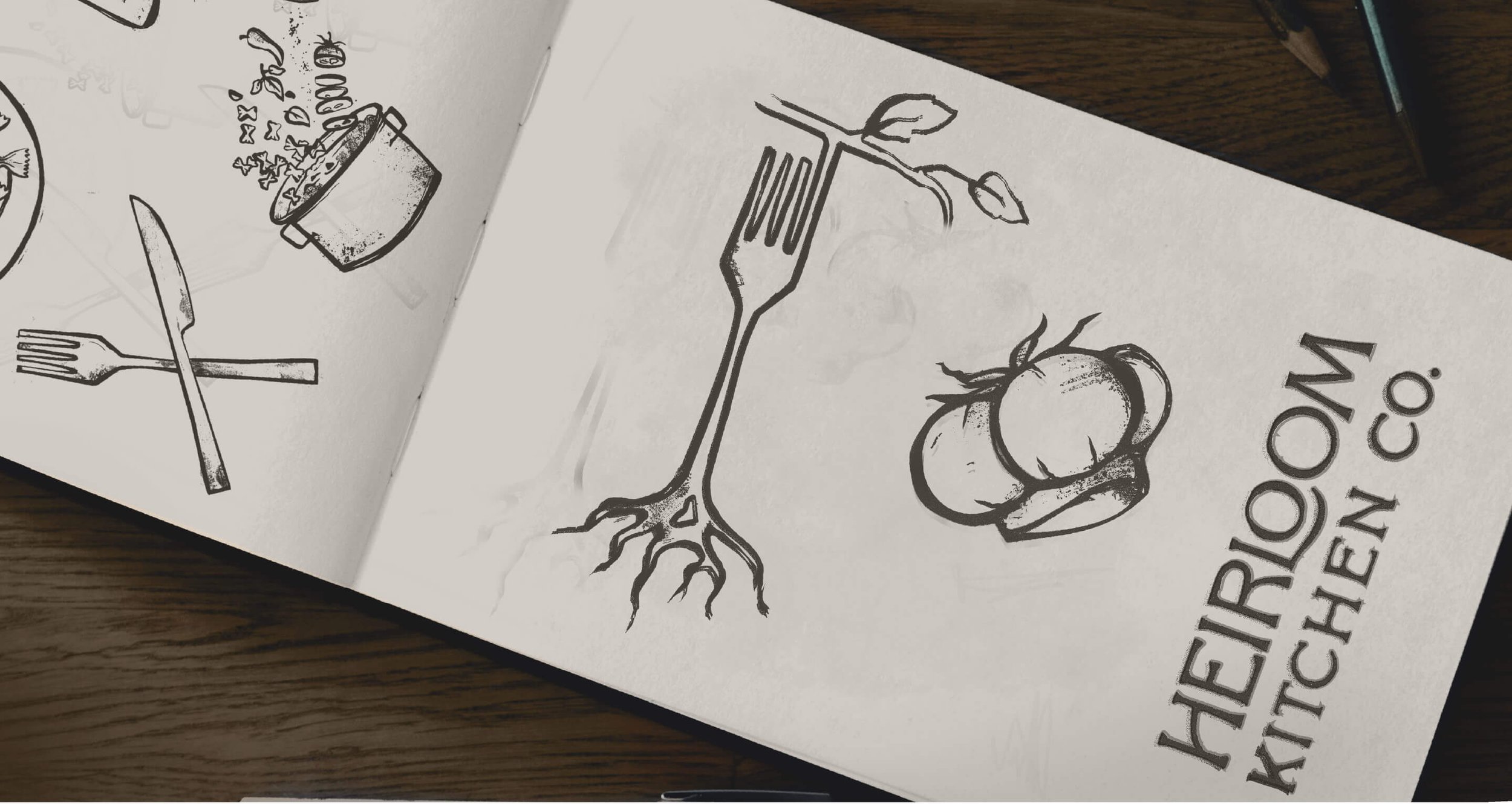
Paying tribute to the signature heirloom tomato the company was named after, we opened the sketch pad and illustrated a mark that not only uniquely communicated catering, but truly felt like Heirloom Kitchen in both its essence and quality.
A hand-crafted logo suite deliciously designed for growth.
The right ingredients to create a feast for the eyes.
BRAND VISUALS
The development of the logo suite was followed up with fonts that shared a modern but organic feel — because like wine and cheese, what’s a logo without perfectly paired typography? To top it off, the vibrant, organic color palette was created by pulling color swatches directly from the kitchen’s most used ingredients, helping ensure continuity with their current and future photography — a perfect palette for customer-discerning palates.
Drawing from
a brand’s roots.
CUSTOM ILLUSTRATIONS
Inspired by vintage recipe books Chef Tracy grew up reading on her family’s farm, we sketched and digitized a library of custom illustrations to connect the updated brand to its homegrown roots.
PRINT TEMPLATES
Flexible brand materials
for flexible catering.
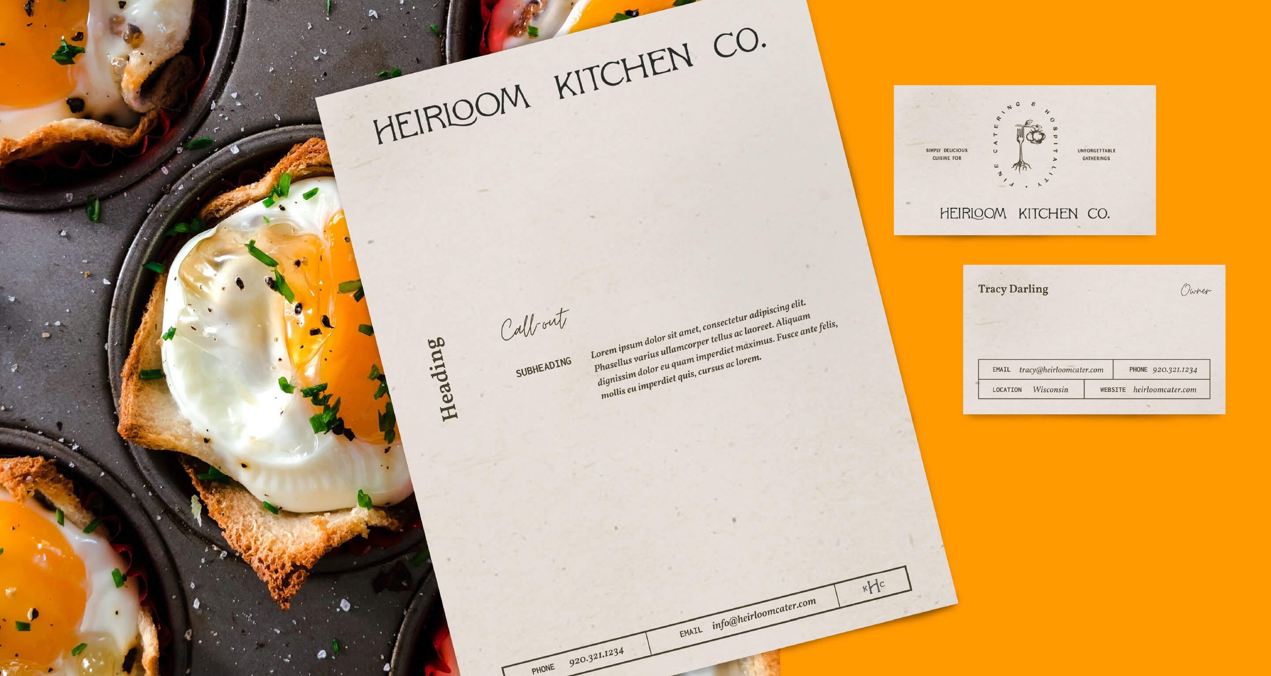
Heirloom Kitchen Company needs to update menus, table cards, sell sheets, business cards and event signage constantly, and often at the last minute, making it necessary to be able to do it themselves. We designed a variety of custom-branded Canva templates that can be edited quickly without sacrificing brand aesthetic or voice.

SOCIAL MEDIA TEMPLATES
Putting the icing on the digital cake.
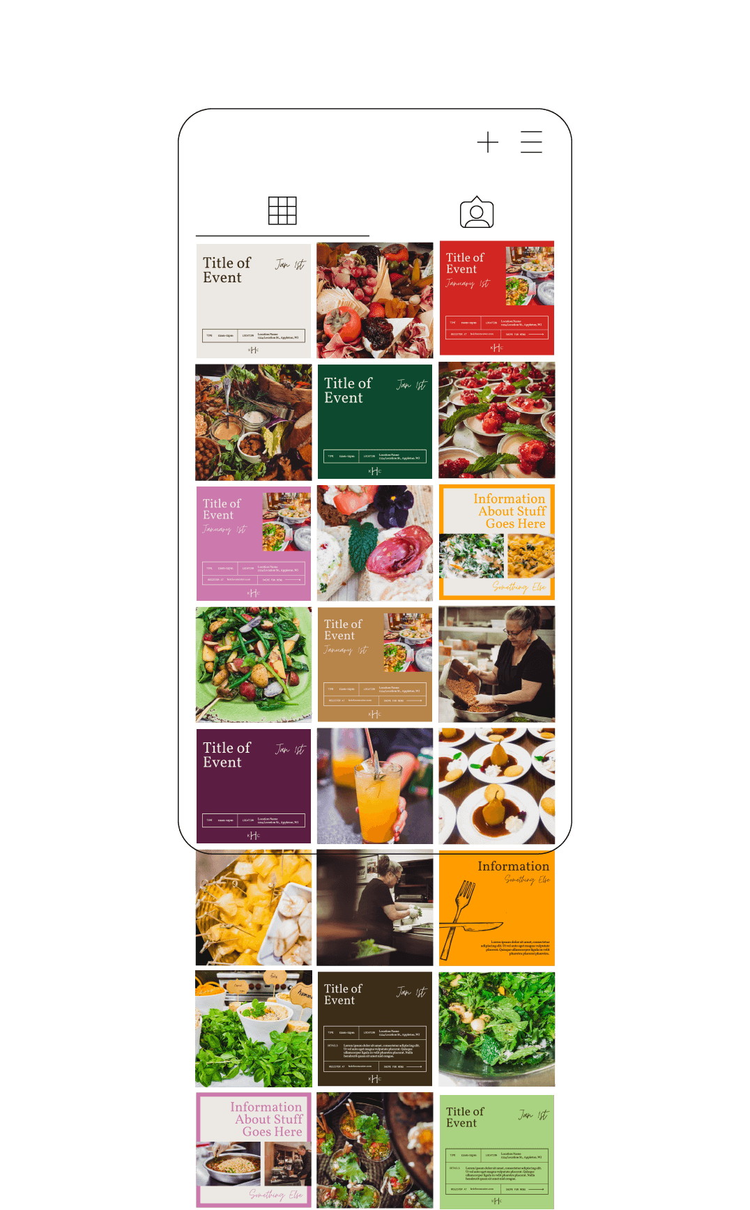
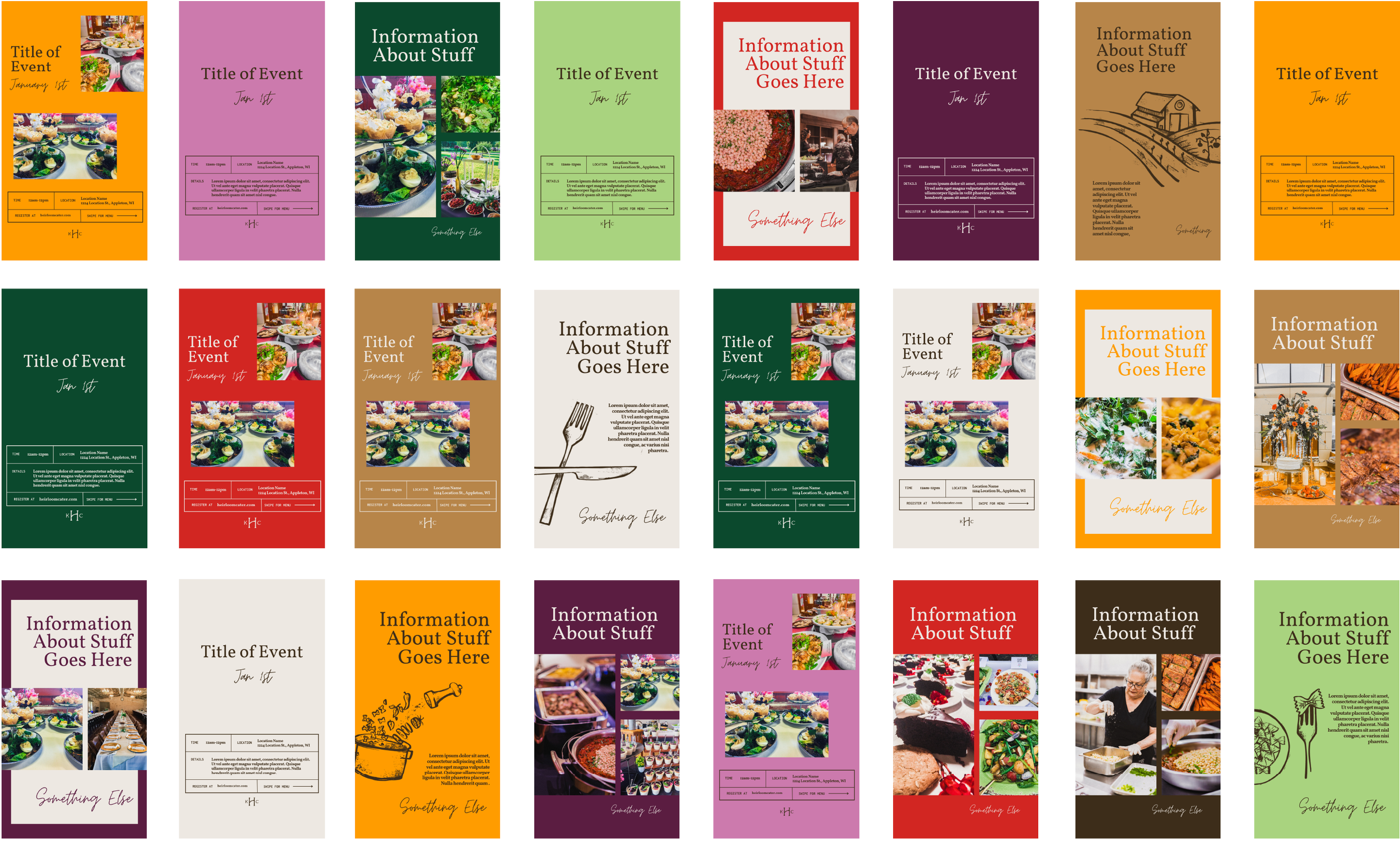
Our strategy for social media was simple: bring their library of delicious, beautiful food photos front and center. Our focus was to categorize the content so their wedding, corporate and general audiences can easily find what they are looking for. Similar to the print materials, we created branded Facebook and Instagram Canva templates to make frequent posting more efficient and aesthetically cohesive.
WEBSITE DESIGN & DEVELOPMENT
A simple, beautiful site that caters to the audience.
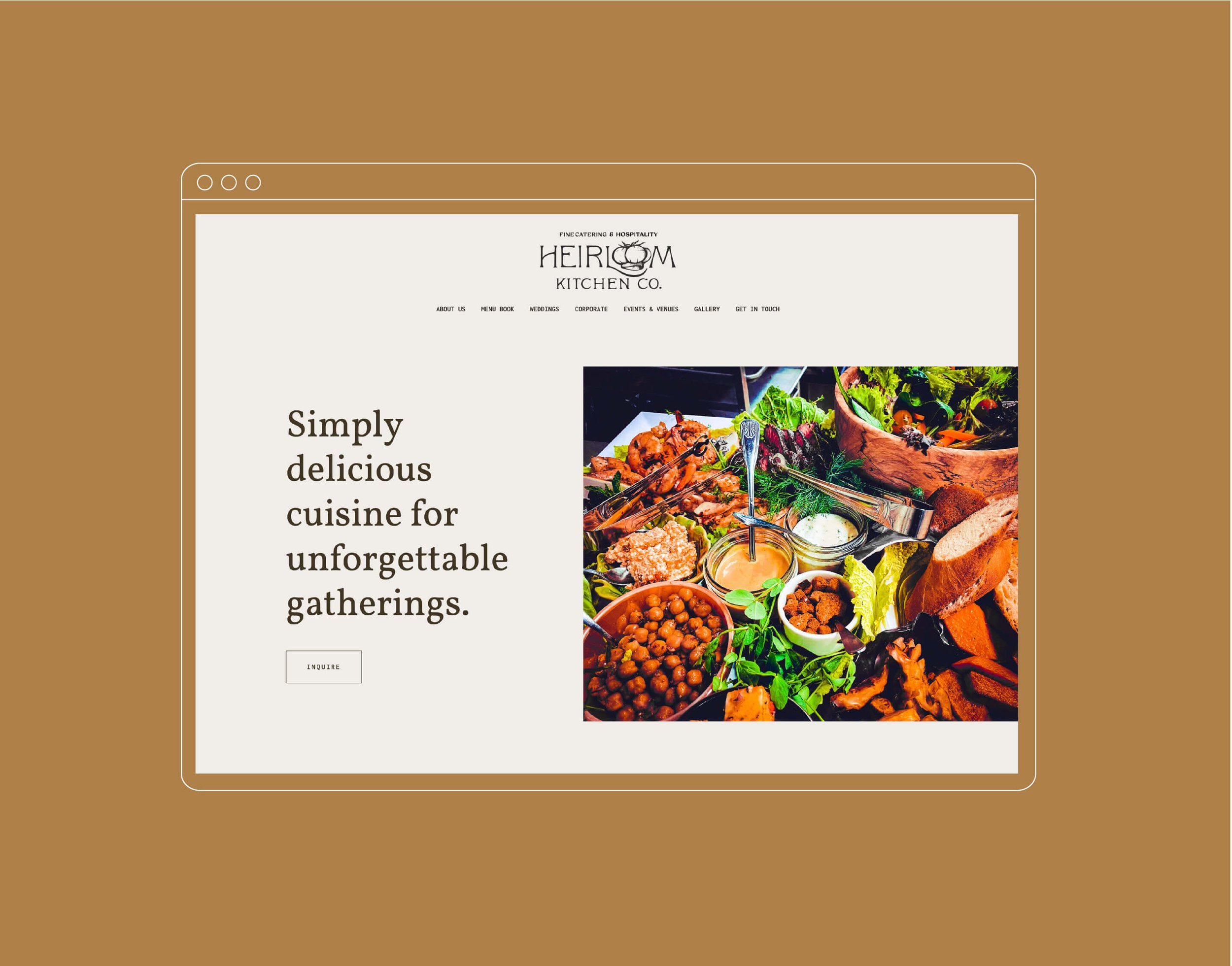
With the website being a first point of contact for many of their customers, Heirloom Kitchen Company needed a no-frills, responsive site to act as an informational hub.
Our ultimate goal was to have a digital space that felt like walking in the doors to Heirloom’s kitchen and talking directly to Chef Tracy. Functionally, we also wanted to provide key information quickly, which would reduce the amount of emails and phone calls that flooded the staff. As we often do, we chose to design and develop a custom site in Squarespace because of its ability to be maintained by the client with minimal training and experience — allowing the team to manage frequent updates to menus and occasionally other information.
WRAPPING THINGS UP


