Propagating a credit union’s brand in the community it serves.
PROJECT
Brand Evolution; Marketing Strategy and Execution
PARTNER
Evergreen Credit Union
ASSIGNMENT
Brand Strategy
Brand Messaging
Logo Evolution
Marketing Strategy
Template Design
Website Design
Digital Marketing
PROJECT OVERVIEW
Evergreen Credit Union (ECU) breaks the industry norm by treating members like family, not transactions. — genuinely caring about their goals and long-term well-being. ECU also believes supporting your community means caring about the environment they live in, which has led them to their role as the only sustainability-centric financial institution in Wisconsin,
However, just being better than your competition isn’t enough—you need to let the world know. In this case, it meant slightly modernizing the brand visuals and updating messaging with the backing of a thoughtful brand strategy. The next steps were designing and developing a new, more functional, website supported by a clear marketing strategy and ongoing print and digital marketing.
That’s where we come in.

A Strategic Approach:
Pruning and growing the brand, without uprooting it.
CULTIVATING THE COPY
Following our usual process of research and discovery, our goal was to identify what makes Evergreen special, why people should care, and how to quickly communicate that across all marketing mediums. By interviewing the staff, gathering testimonials from members, and researching local and national competitors, we gained the insights needed to define the brand’s mission, core values, key differentiators, value proposition, keywords/phrases and ultimately honest and impactful marketing messaging.


A sustainable approach to a brand refresh.
Our research revealed some limitations and inconsistencies in the current brand visuals. If we were going to make the impact the credit union hoped for, then the logo, fonts, colors and imagery were going to need to evolve. Knowing that the budget was limited and a full brand refresh wasn’t in the cards right away, we came up with a plan. Ultimately, we would tweak, refine and augment the current visuals to ensure we have the assets needed without a massive rebrand, reprinting of materials and branch signage updates.


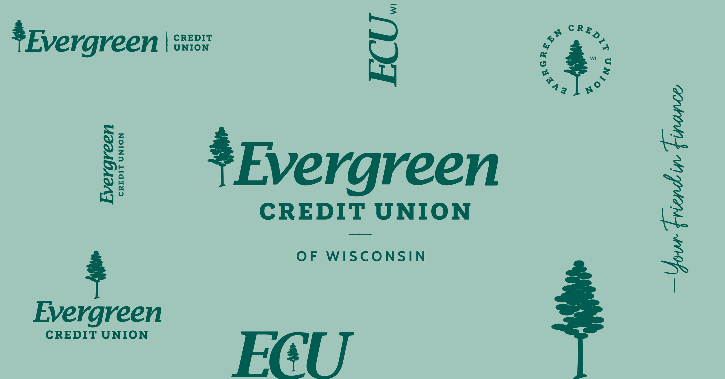
Thousands of brands in all kinds of industries share the Evergreen name, posing the additional challenge of trying to set the credit union apart. The visual hierarchy of the existing logo also wasn’t helping, so we strategically simplified it by downsizing the non-distinctive pine tree logo mark, emphasizing the “Credit Union” by adding “of Wisconsin” and cleaning up the wordmark. We also expanded the logo suite by creating additional vertical, circular and abbreviated versions for use on social and beyond.
Logo Evolution

FONT LIBRARY
Thousands of brands in all kinds of industries share the Evergreen name, posing the additional challenge of trying to set the credit union apart. The visual hierarchy of the existing logo also wasn’t helping, so we strategically simplified it by downsizing the non-distinctive pine tree logo mark, emphasizing the “Credit Union” by adding “of Wisconsin” and cleaning up the wordmark. We also expanded the logo suite by creating additional vertical, circular and abbreviated versions for use on social and beyond.
COLOR PALETTE
The existing palette lacked accent colors for designing the website, allowing us to choose additional colors that truly complement the brand. In doing this, we explored a more sophisticated monochromatic palette to use in tactics that live in visually busy environments, such as Google display ads and community publications.
IMAGERY
Aside from their commitment to sustainability, connecting to members on a real, human level is part of what makes ECU so special. Traditionally, the imagery used in print and online used a green filter overlay to make their image library look more consistent, but unfortunately that left the images feeling cold and lifeless. Using Lightroom, we created a new photo preset that deepened the greens bringing them into the palette, while pulling out some of the warmer, welcoming brand colors to help breathe life into existing and future brand imagery.
WEBSITE DESIGN
A website as friendly as its branch locations.
Our approach to designing ECU’s website was deeply rooted in our (slightly obsessive) research. The credit union had a small number of physical branch locations, which made its online “branch” all the more important.
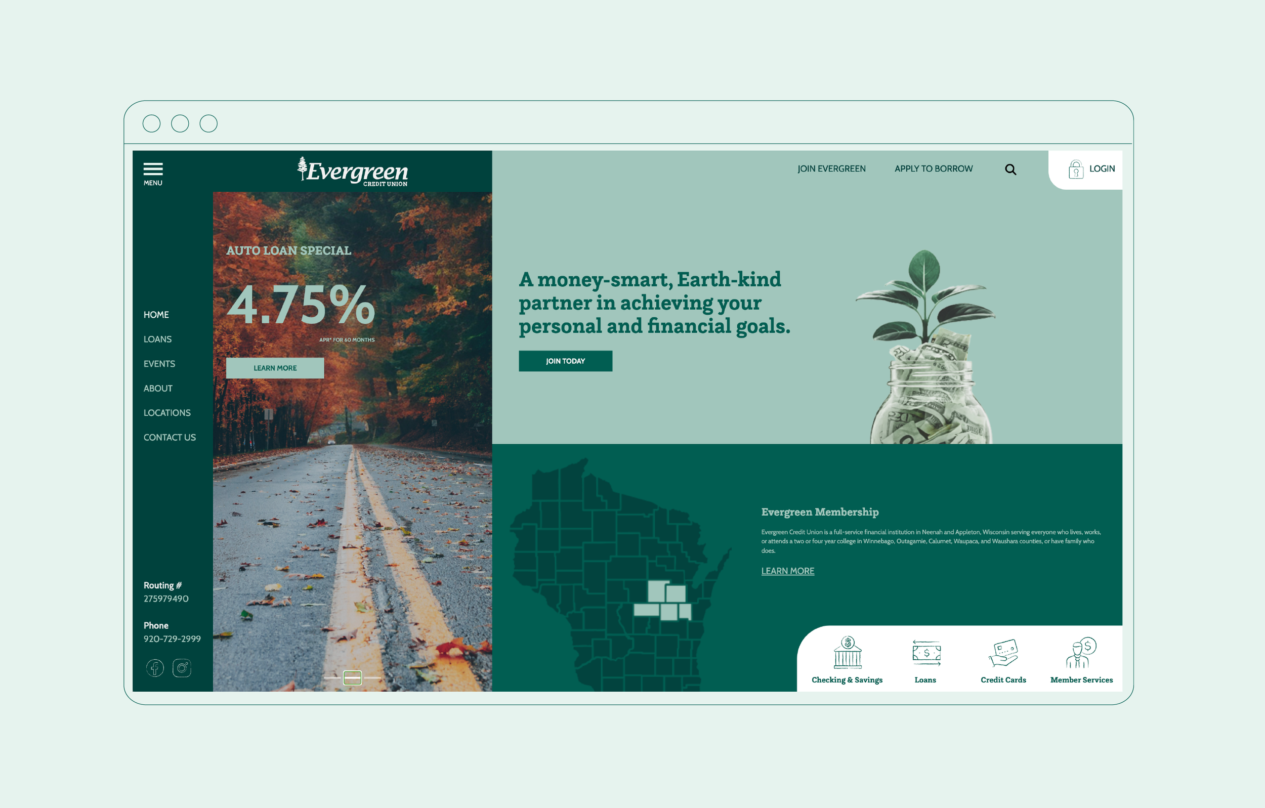
We worked meticulously to design a one-of-a-kind, app-like UI that dynamically brought the most important information front and center, closely collaborating with their developer throughout the process to ensure beauty and functionality. In addition to creating cyclical user journeys that made it easy for users to find what they needed, we designed, and continue to design, key landing pages that serve as information destinations for new traffic coming in from Google ad campaigns.
Plotting the site architecture.
Financial websites inherently contain a ton of content that can easily get buried. Taking into account the old site analytics and traffic patterns, feedback from staff, members, and the future business objectives, we created a visual site map to optimize user flow and identify any roadblocks before diving into design or development.
THE DESIGN
Even though the site was completely redesigned from the ground up, we wanted the result to feel familiar to existing users. By using some familiar brand elements, fresh and approachable photography and an intuitive user interface, the new site was well-received and easily navigated by users of all ages once launched.
BEFORE
AFTER

MARKETING
A marketing strategy that sees the forest for the trees.
Our primary focus in developing a first-time marketing strategy for ECU was to maximize their budget by focusing on truly narrowing down their goals and target markets and funneling resources to the most impactful results, ensuring every dollar works harder while strengthening the credit union’s connection to its community.
Identifying opportunities ripe for the picking.
TARGET AUDIENCE AND PERSONAS
We then define hyper-focused profiles based on key community segments, demographics, psychographics, and behaviors of the target audience. These detailed member personas help us to personalize messaging and improve engagement.
COMPETITIVE ANALYSIS
Next, we evaluate other competing financial institutions, identifying service gaps and opportunities for differentiation through market positioning that focuses on the brand’s unique value proposition.
RESEARCH AND REVIEW
Our process begins with analyzing the credit union’s current performance, community demographics, and past campaigns to uncover insights that align with organizational goals.
RESULTS AND MARKETING PLAN
Finally, we craft a detailed plan, outlining tactics, channels, and timelines, that leverages cost-effective tactics like digital advertising, community events, and referral programs, with measurable KPIs to track and optimize success.

PRINT ADVERTISING
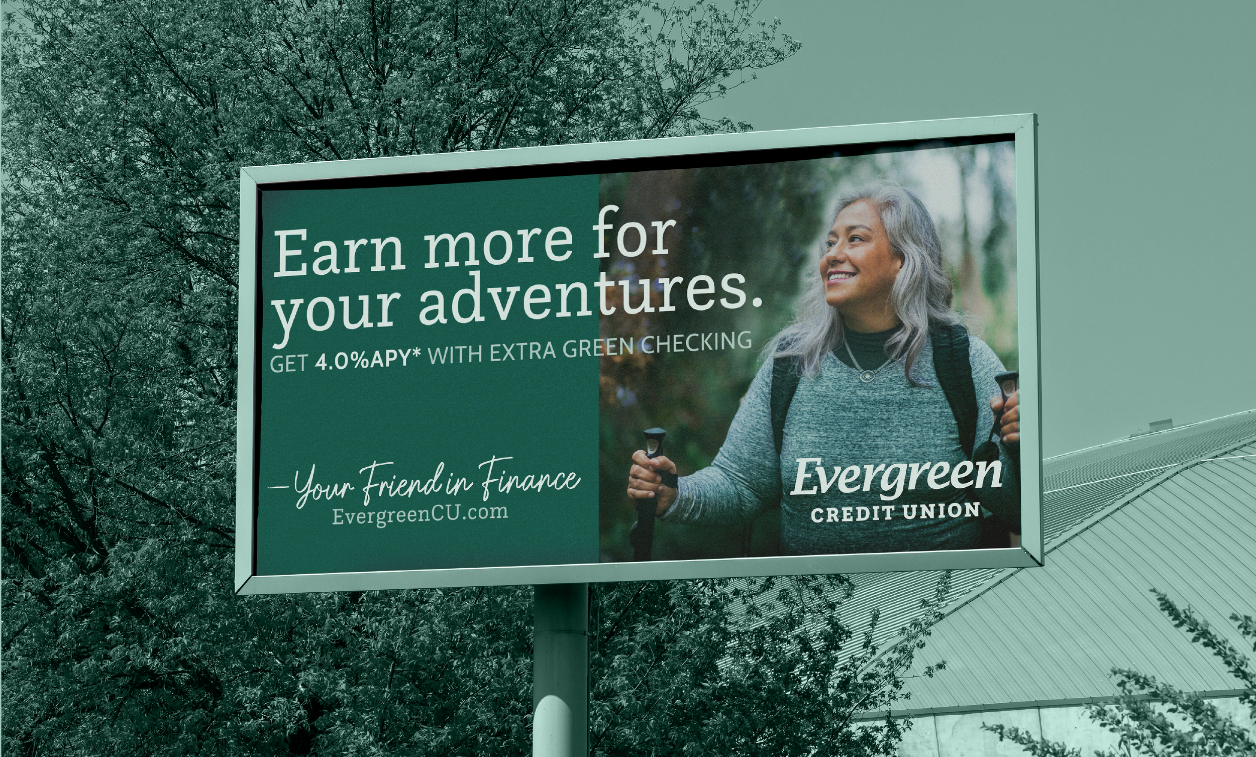
To ensure consistency and impact across all channels, we designed initial print pieces, including a billboard, and provided templates for future needs.
Digital Marketing
Our primary focus was to streamline the credit union’s digital marketing efforts to optimize budget distribution and maximize impact. By regularly monitoring performance metrics, we refined the strategy as needed to ensure consistent, data-driven results.
PAID
Paid advertising duties included comprehensive Google Ad campaigns that span quarterly and monthly, with the plan to eventually evolve to include avenues like YouTube and other social platforms.
ORGANIC
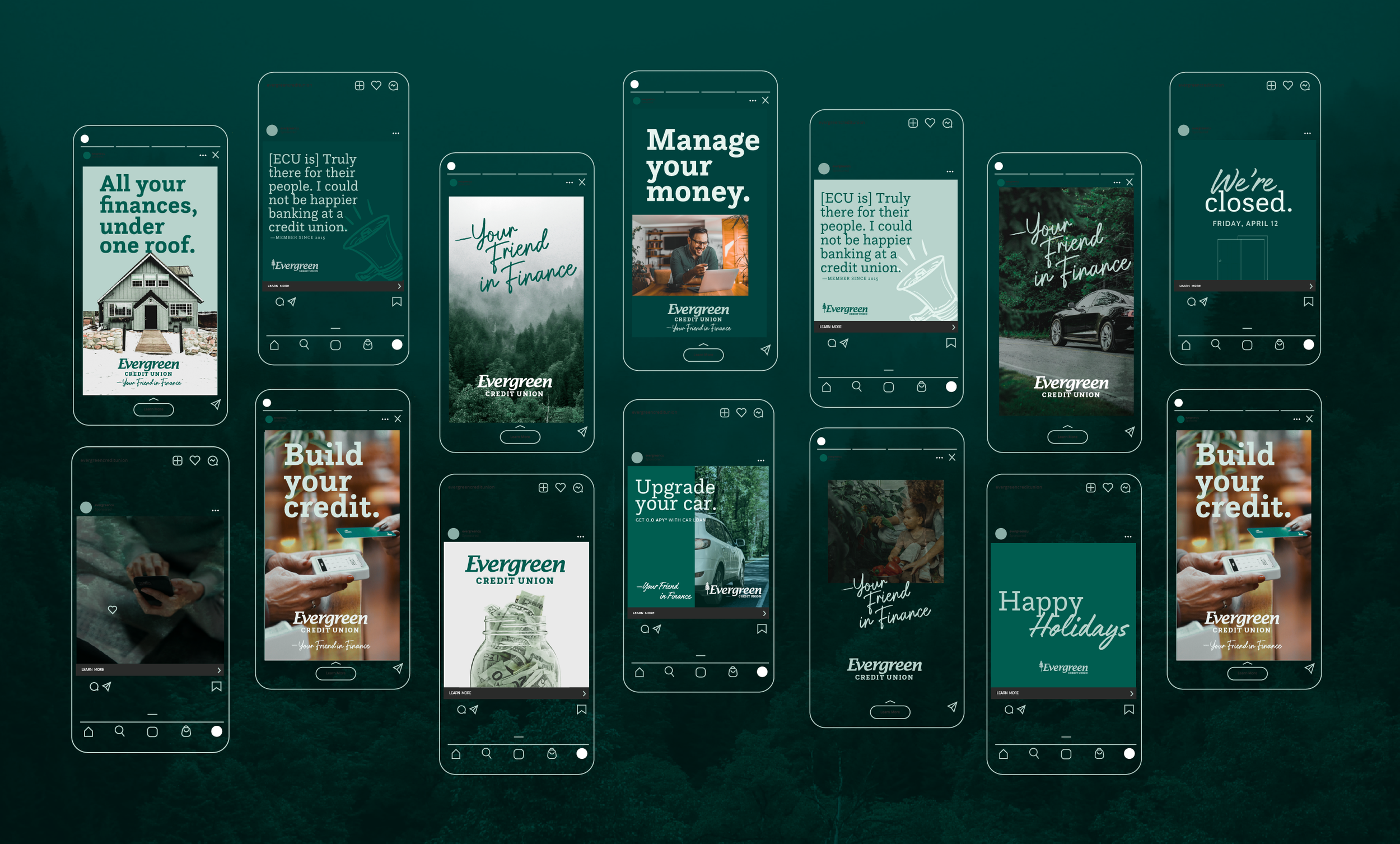
Organic advertising was rooted in templates custom designed in Canva for them to execute a more cohesive approach to social media, reinforcing the paid ad campaigns and ultimately build and foster an online community.

WRAPPING THINGS UP


