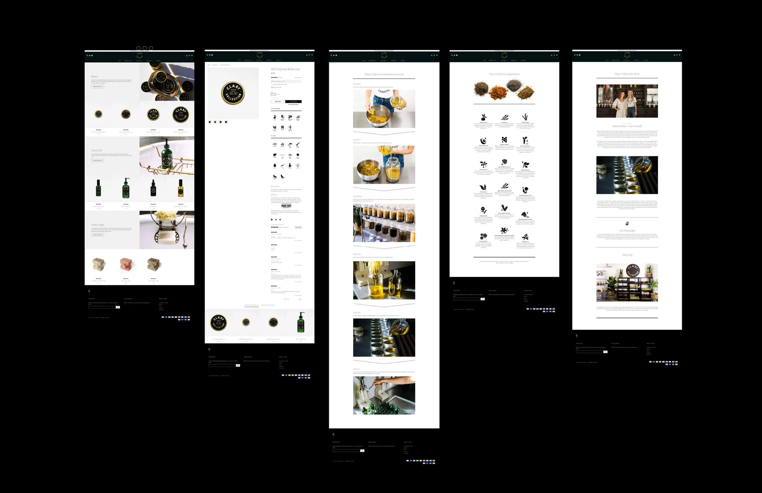
Redefining a successful skincare line by rerooting it in herbal traditions.
PROJECT
Rebrand and Launch
PARTNER
Clary Collection
ASSIGNMENT
Brand Research
Brand Strategy
Brand Messaging
Brand Identity
Logo Design
Icon Design
Brand Guidelines
Package Design
Media Kit
Lifestyle Photography
Product Photography
Social Media Template Design
Shopify Website Design
―
Clary Collection is a women-founded and operated herbal skincare brand born in the Nashville kitchens of Jen Goodall and Adriel Denae. During their pregnancies, the two women bonded over a newfound awareness of the value of safe skincare products. Continually coming up short on their search to find truly clean products in a greenwashed industry, they began developing an entire line of balms and oils certified free of ingredients known to harm human health and ecosystems. Quickly outgrowing their kitchens, Clary moved into their current production space where they now infuse, strain and pour our oils and balms for their product line that stocks over 180 stores worldwide and online. Through their growth, Unlisted began collaborating with Clary in developing strategic creative to level up their brand and marketing efforts.

OUR APPROACH
The Clary Collection brand already had significant equity and recognition. Instead of suggesting a total rebrand, we proposed taking what was already working and refining, expanding, and encapsulating it into a formal, comprehensive brand strategy and style guide that could be implemented across all their channels.
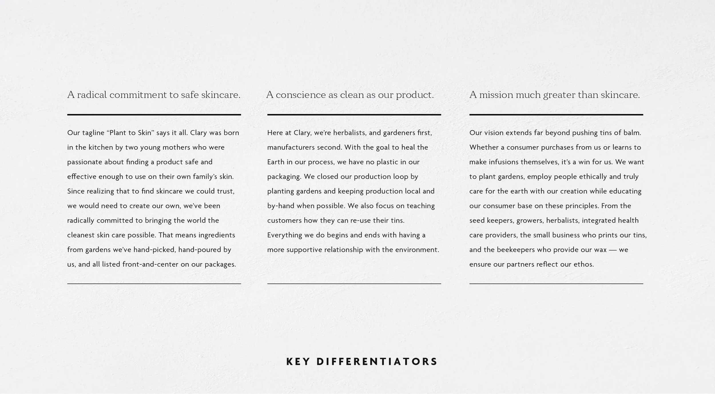
A mission much greater than skincare translated into an inclusive, earthkind message.
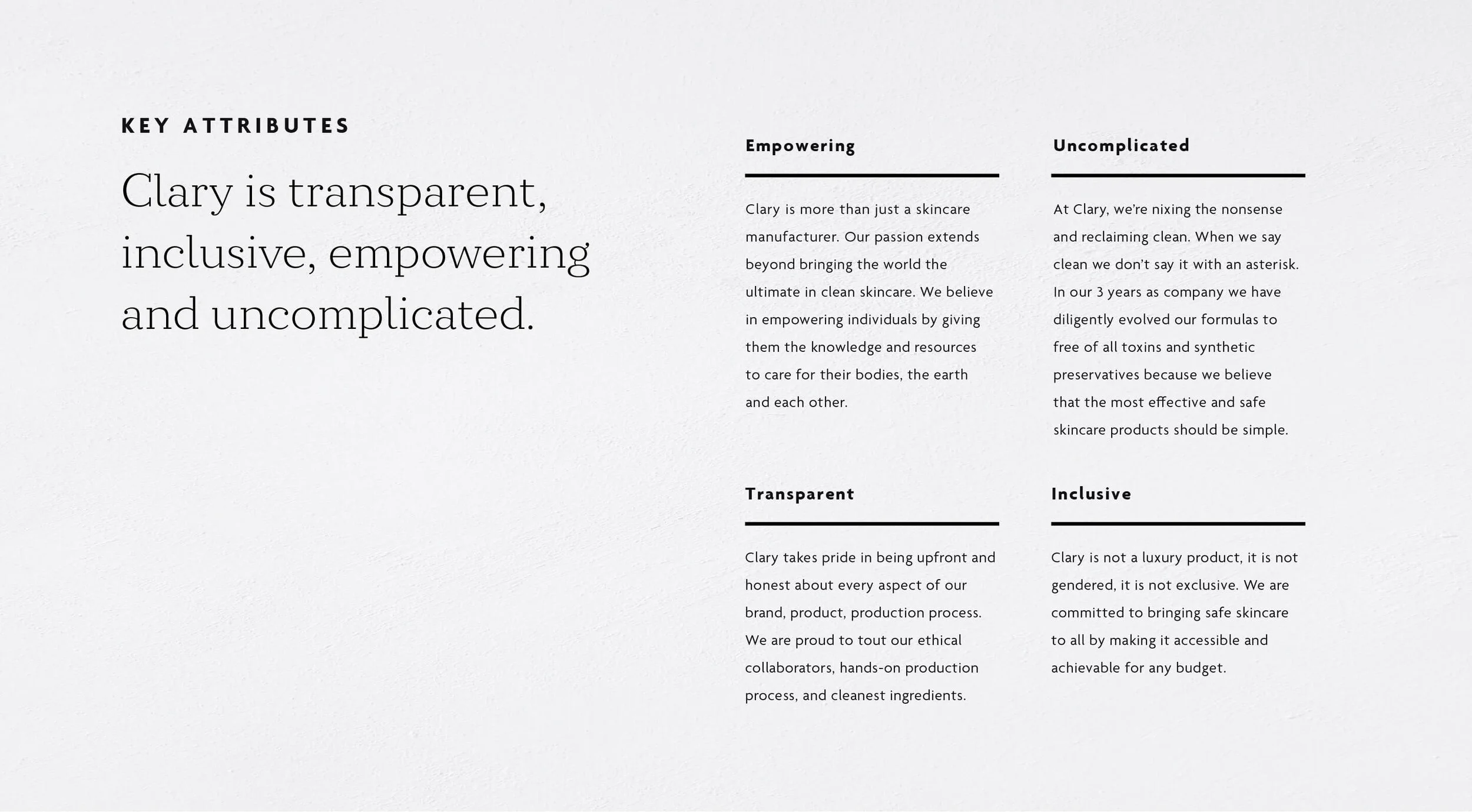
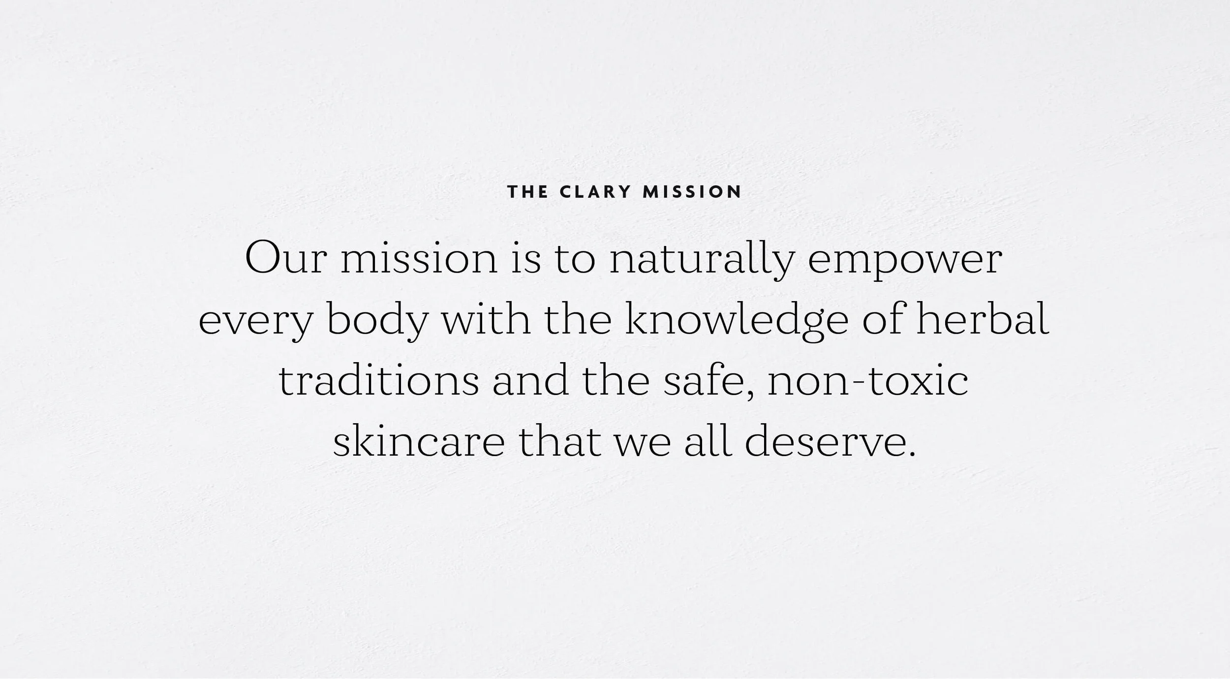
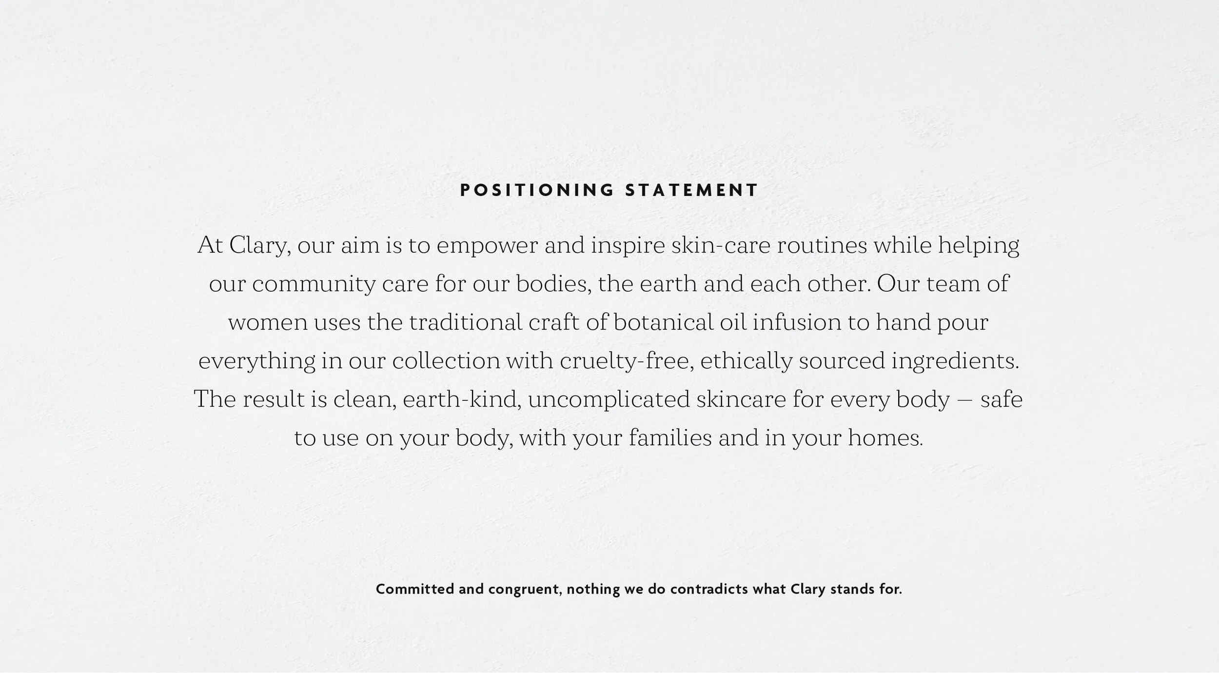
The brand’s messaging had always come from the hearts of the founders, but this was becoming harder for their internal team to capture and replicate as the company grew. Using data from an in-depth brand analysis conducted at Vanderbilt University, we mined the most prominent findings, combined them with our own internal keyword and brand research, and ultimately organized it all into key attributes and differentiators, a mission statement and value proposition.

The same logo, but better.
The original mark had great market recognition. But as with many new company logos, Clary’s was created quickly and without due process. So, we took the logo and rebuilt it — maintaining some of the hand-drawn feel while refining the font, symmetry and spacing.
We did have some concerns with the versatility of the circle logo. So we added two new layout variations a stacked version that would fit in a more traditional horizontal space, and an icon to serve in smaller spaces like a favicon, all without losing an ounce of brand equity.
VISUAL IDENTITY
After refining the new logo, we paired it with a rich, organic brand color palette to complement the existing brand photography and herbal ingredients, as well as a brand typefaces to give the combined expression of luxury and eco-consciousness.
A radical commitment to transparency.
THE ICON SET
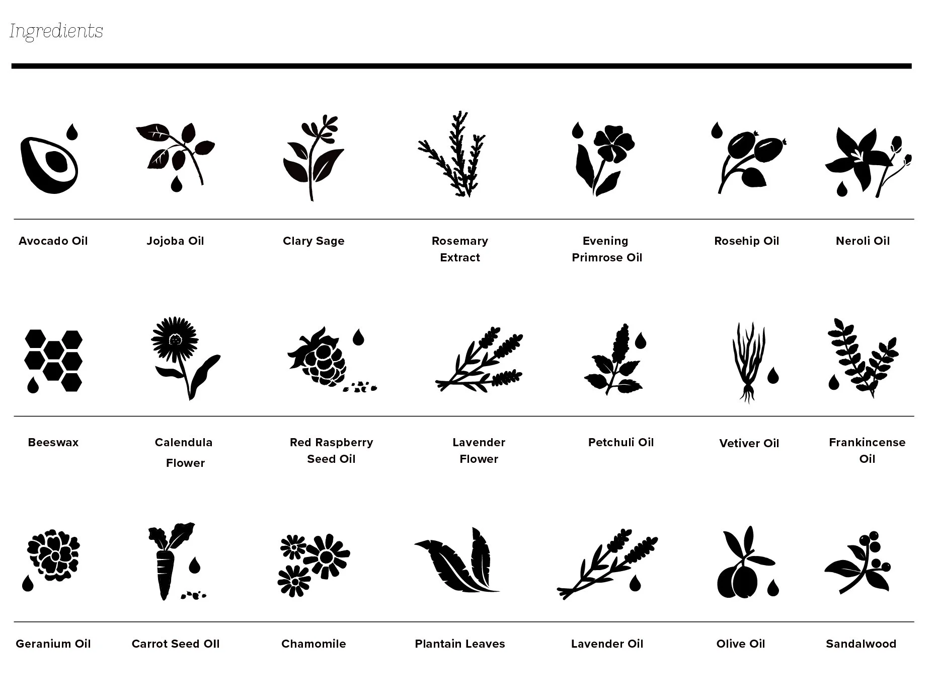
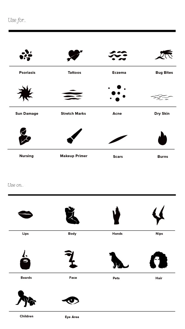
Radical transparency is a key tenet of the Clary brand, and this begins with what goes in their products. We designed an extensive icon system to be used on the website, literature, and retailer shelf to quickly show the ingredients, application and use.
Logistics as creative as the photography.
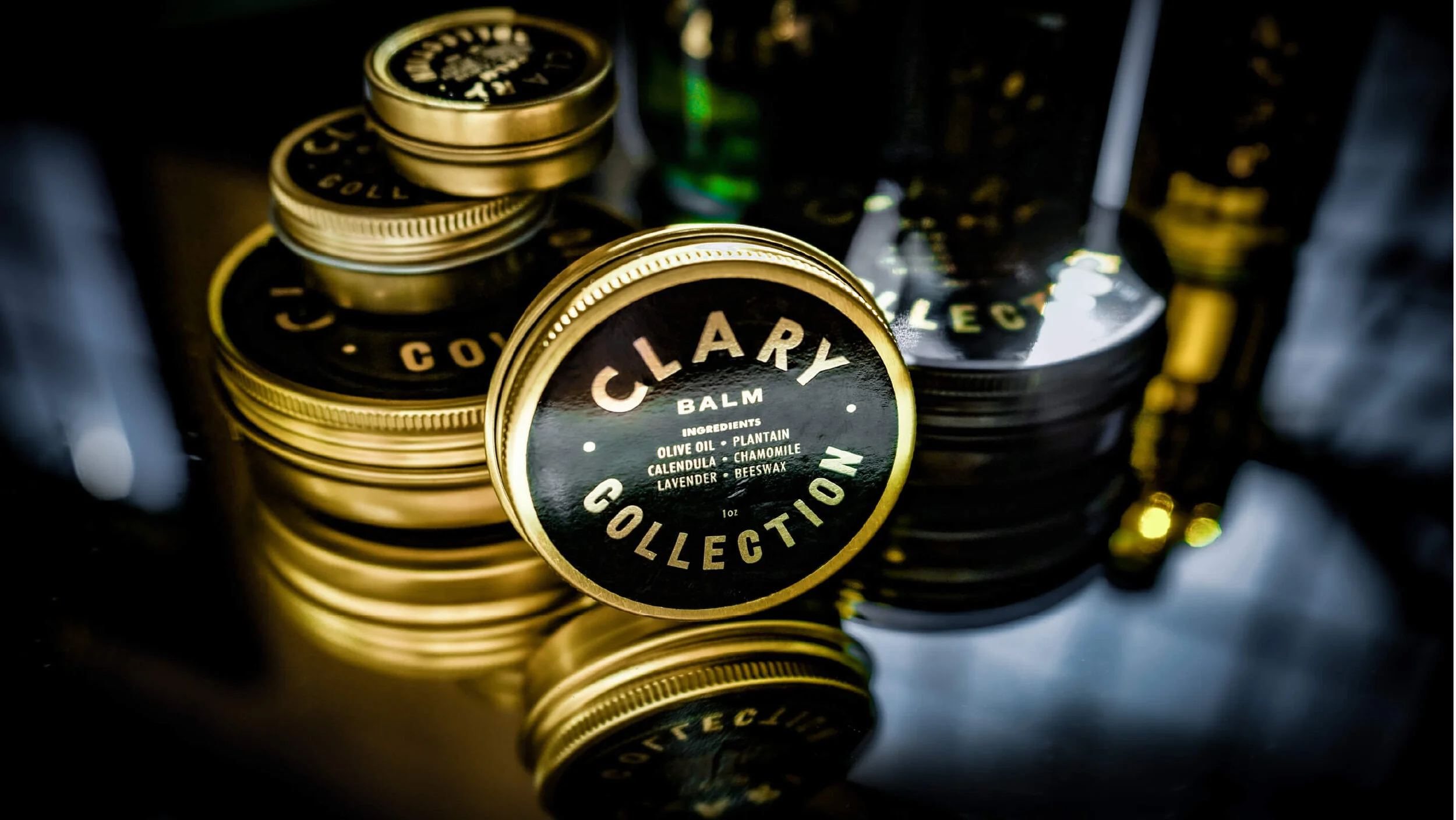
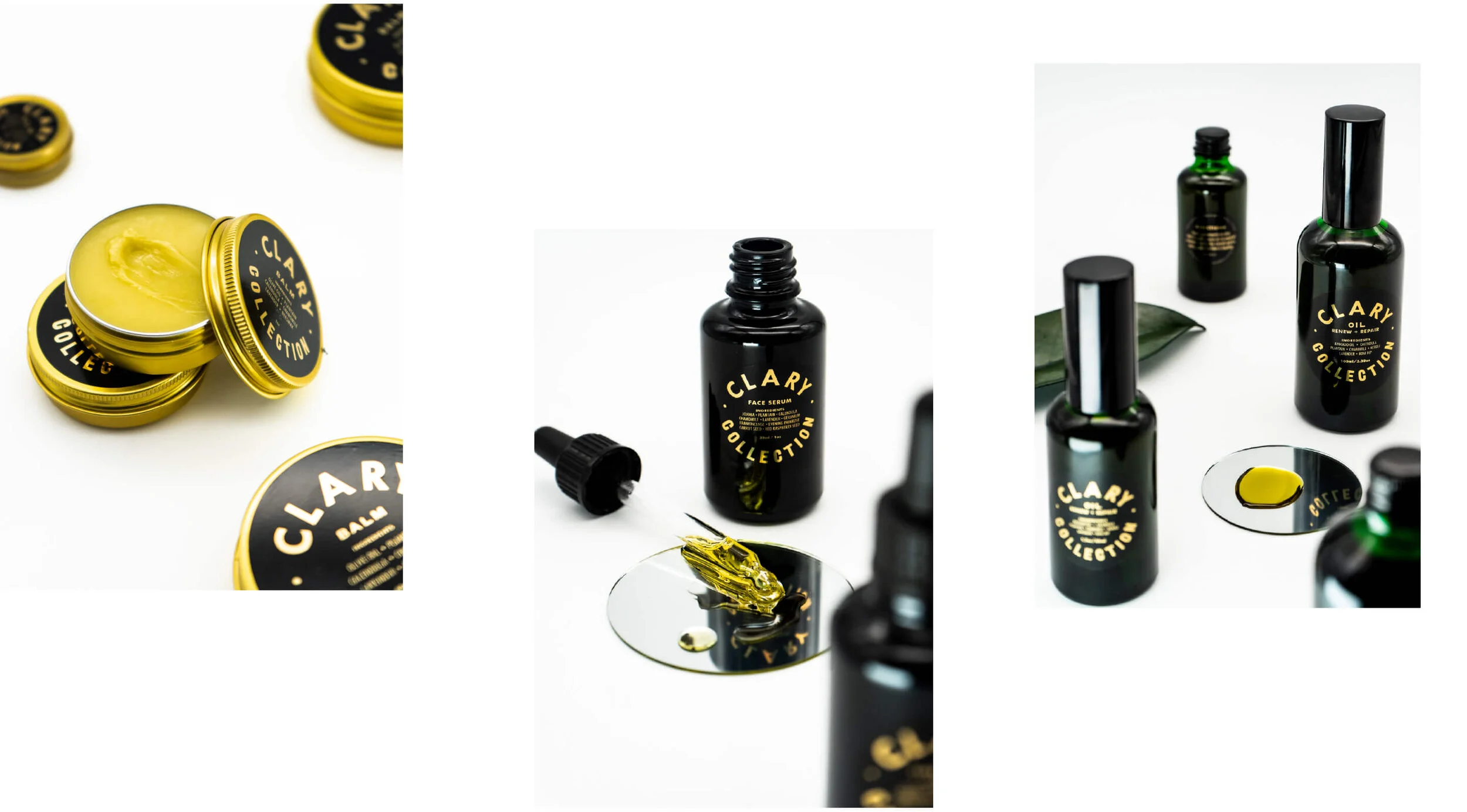
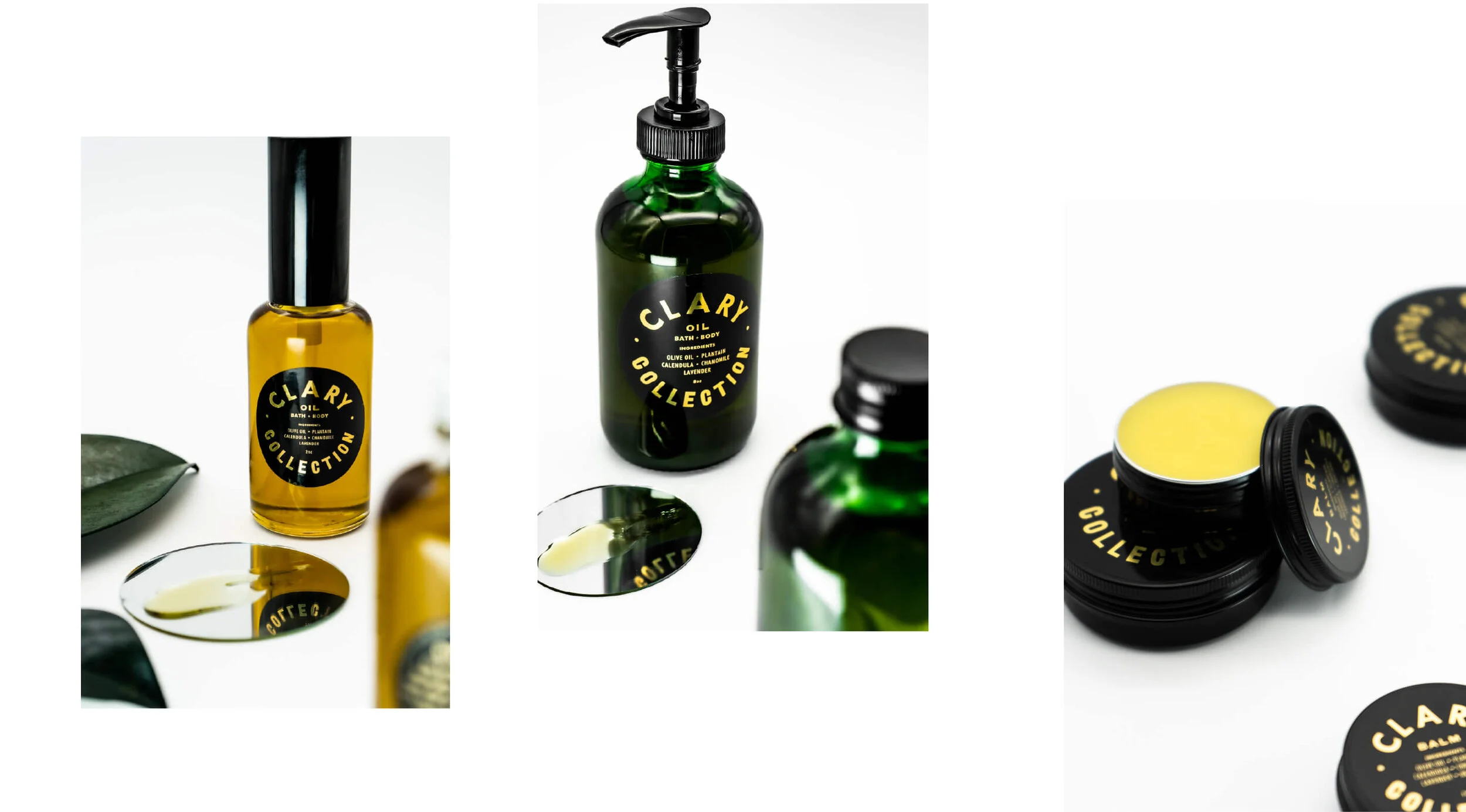
When the COVID pandemic caused packaging delays and impacted the product photography schedule at their Nashville location, the agility of our studio, combined with a holistic oversight of the brand, allowed us to quickly accommodate photoshoots into our overall schedule. Unlisted executed photography of the tins and glass bottles for the website, along with lifestyle photography to represent the brand across campaigns and social media. The kicker? We planned, sourced props and talent, shot and edited images all within two weeks.
A social media strategy that moves at the speed of culture.
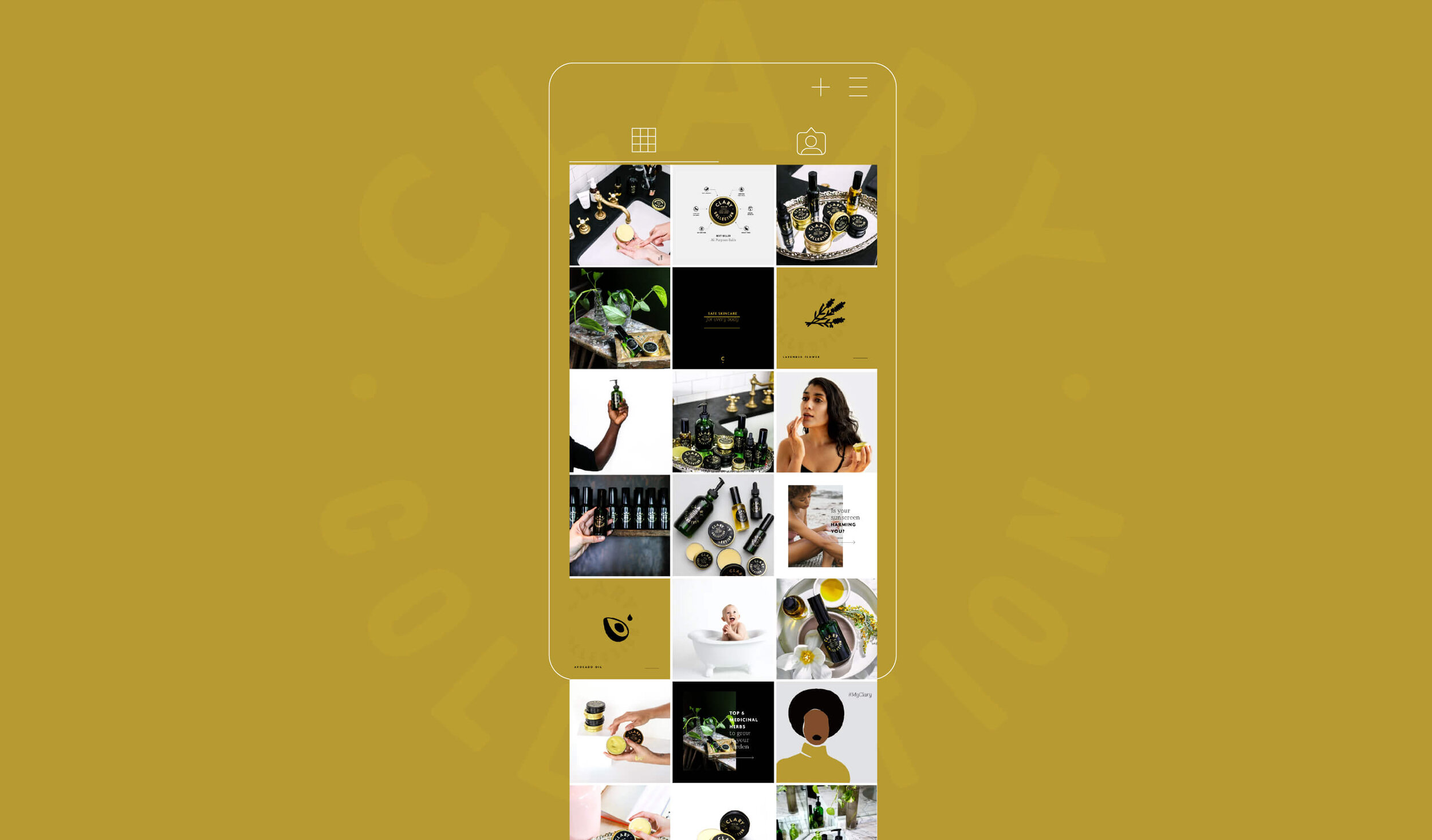
SOCIAL MEDIA PLANNING
During our finalization of Clary’s social media plan, the idea of a ‘strategy’ was turned on its head as the BLM movement peaked. At the start we pulled back presence entirely to create space for more marginalized voices.
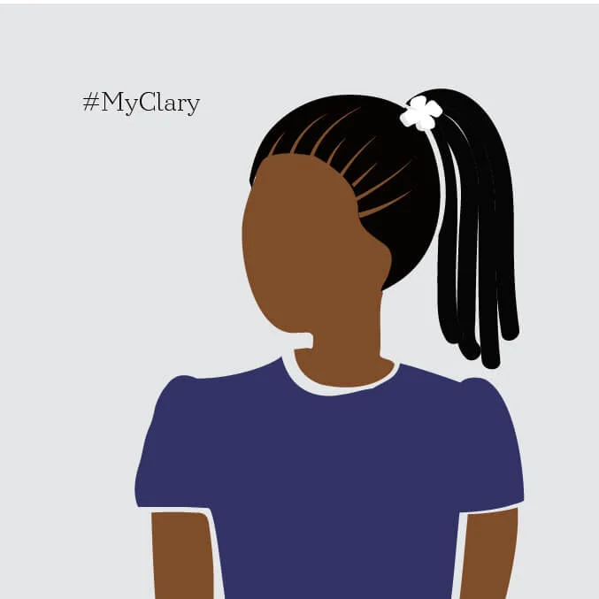
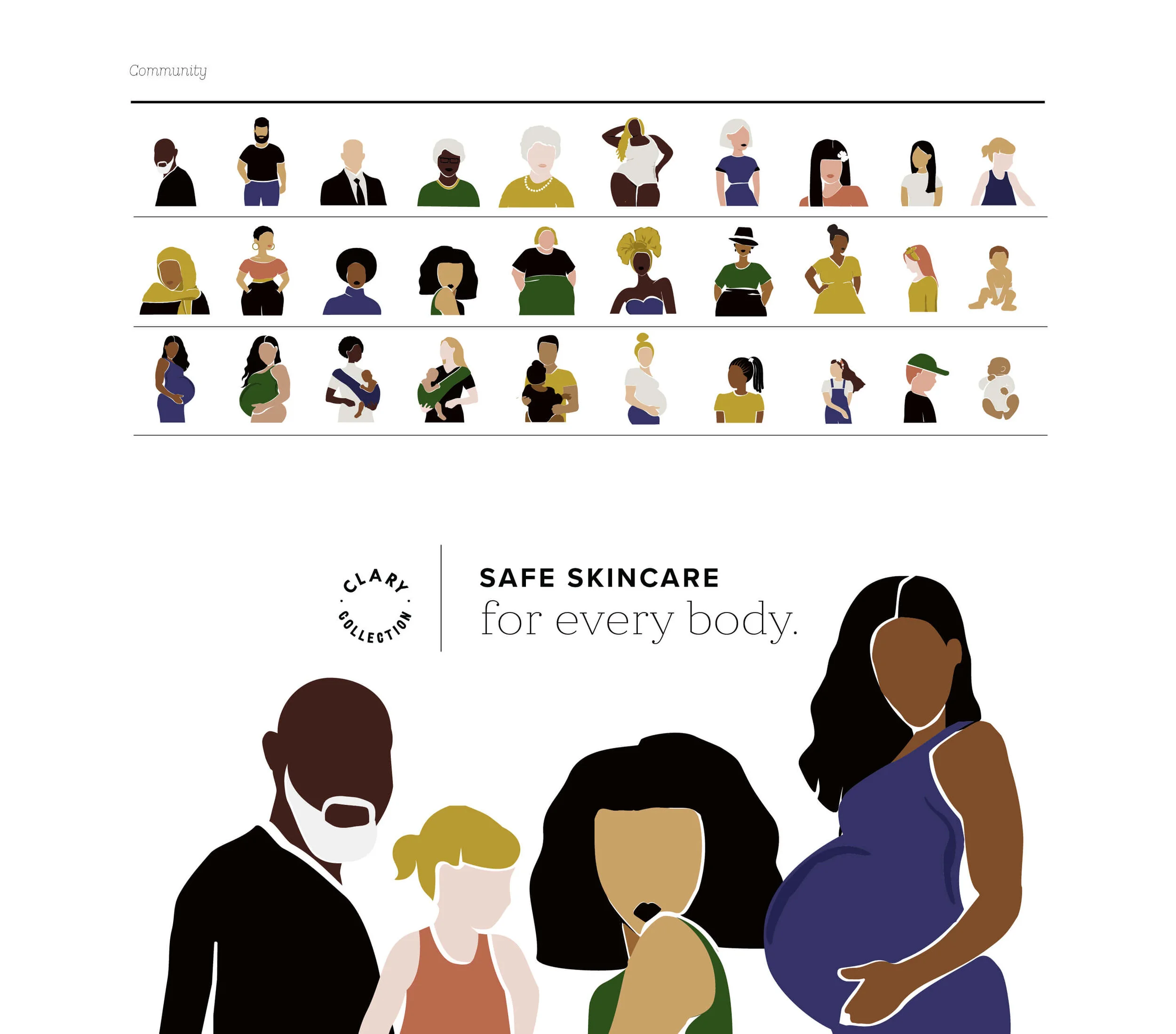
Ultimately, though, we knew that because Clary had initially approached Unlisted with a strong desire to highlight their passion for inclusivity — driving us to develop a set of diverse illustrations to represent their mission statement of providing Safe Skin Care for Every Body — they were in a position to thoughtfully join the conversation. Strategy and marketing out the window, we all focused on listening, learning and educating from the heart.
Making Clary stand out.
Full-service digital ad campaigns, strategized and executed overnight? No problem.
THE OPPORTUNITY
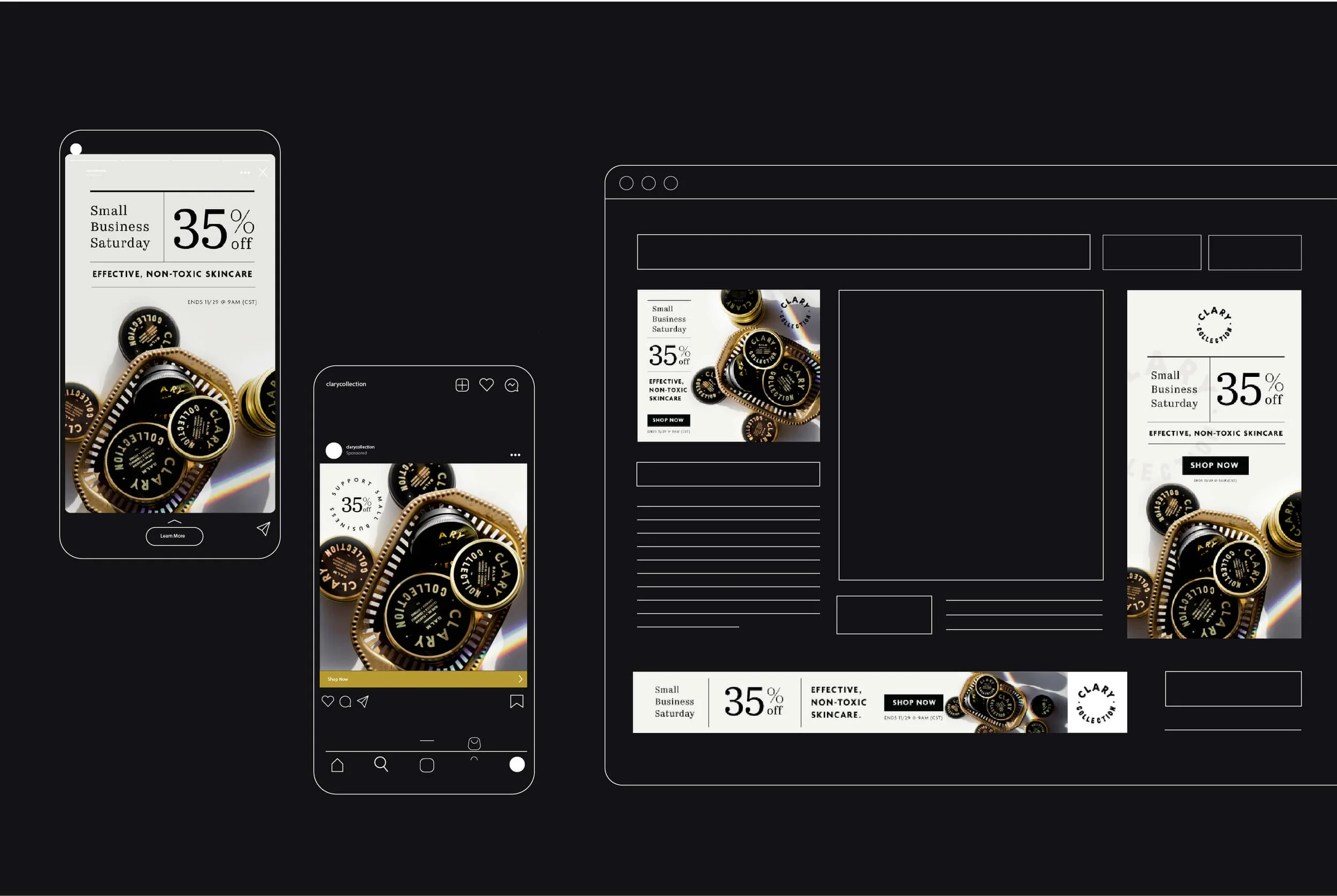
In 2020, online shopping was at an all-time high — especially over the holiday season. The newfound traffic offered Unlisted the perfect opportunity to take the refreshed Clary brand for a spin, running sales to encourage purchasing and attract new customers.
OUR SOLUTION
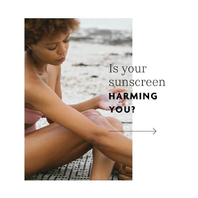
We created more than 60 pieces for five targeted digital ad campaigns on Facebook, Instagram and Google with unique animated video, photo and graphic creative including Black Friday, Small-Business Saturday, Holiday, Clary’s 4th Birthday and Valentine’s Day.
MEDIA KIT
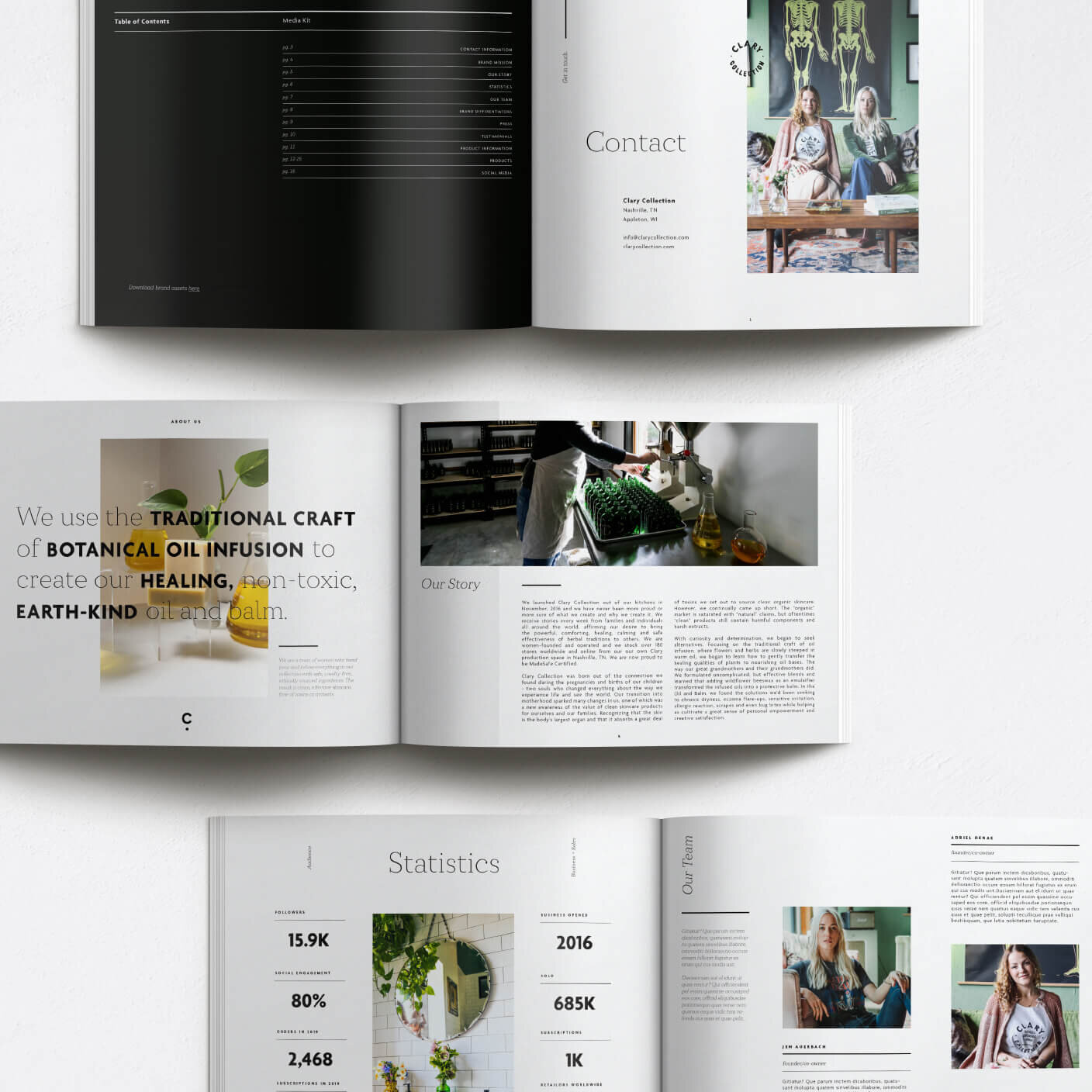
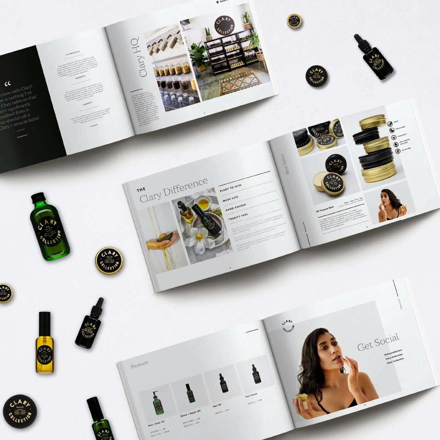
A media kit that makes catalogs jealous.
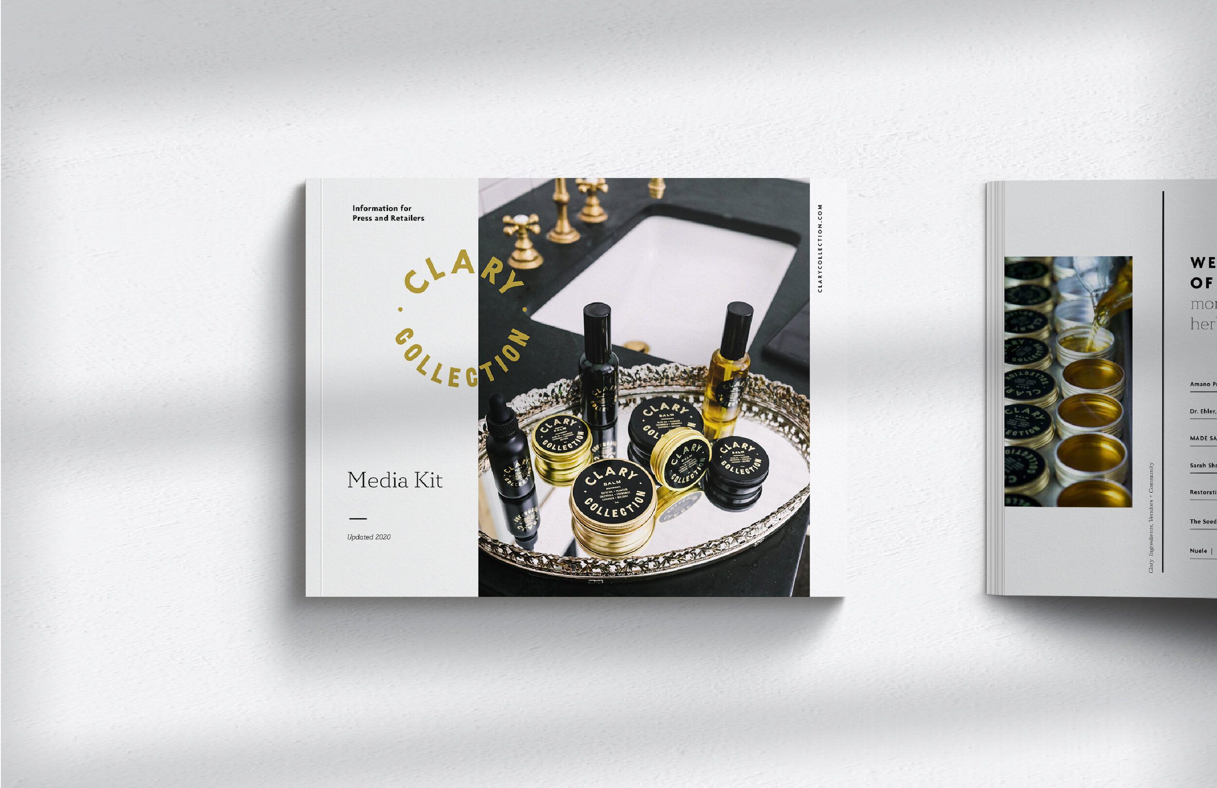
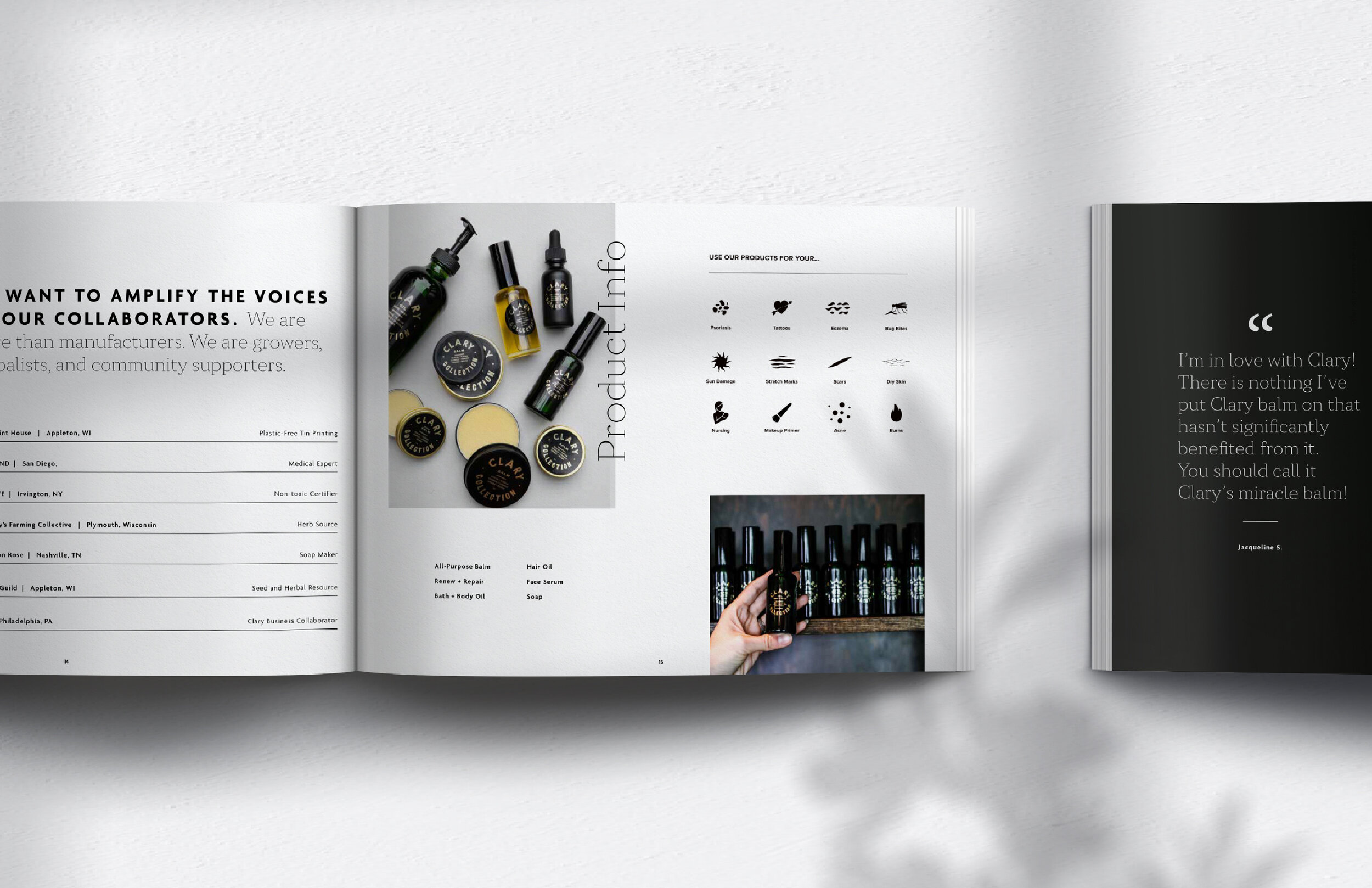
A one stop shop for delivering information to retailers, partners and press on the brand.
Inspired by high-fashion catalog layouts, we took the traditional media kit a step further to ensure our client got the attention it deserved.
A beautiful website to handle the demand.
Clary was growing rapidly and not only needed a website that was visually consistent with their brand, but could handle the traffic. The existing ClaryCollection.com site was hosted in Shopify, with fulfillment integrated into the platform, so we kept it there.
We created a custom design based upon an overall brand strategy to educate customers and encourage them to follow the simple order process. In order to successfully transition the website we also integrated existing and new plug-ins to streamline their sale and order processes.
WRAPPING THINGS UP
Ultimately, we were able to successfully elevate the Clary Collection brand and entire print and digital presence with a timely, yet timeless, strategy, including a strong, genuine platform and cohesive visuals that will continue to set Clary apart and support their exponential growth.


